Smart Panels for Meeting Rooms and Desks
Designed from scratch, used by enterprises worldwide
2025
•
Prague, Czechia / Dubai, UAE
•
On-site / Remote
Highlights
Designed two panel apps: Meeting Room Tablet and Desk Booking Panel
Deployed with multiple enterprise clients
Core flows: instant booking, check-in, extend, view schedule, space info, etc
Live environment data on the room tablet: CO₂, temperature, air quality and more

Overview
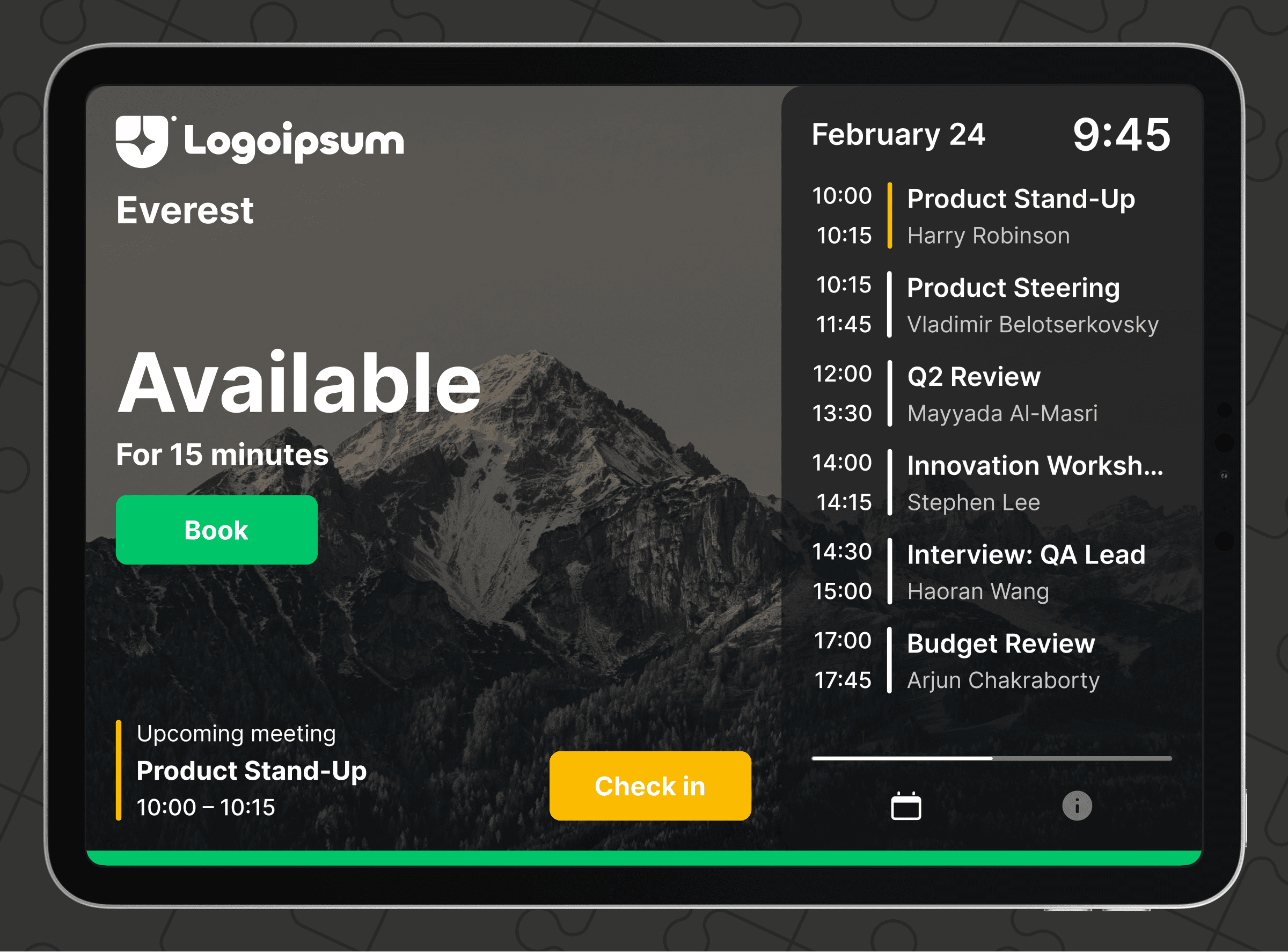
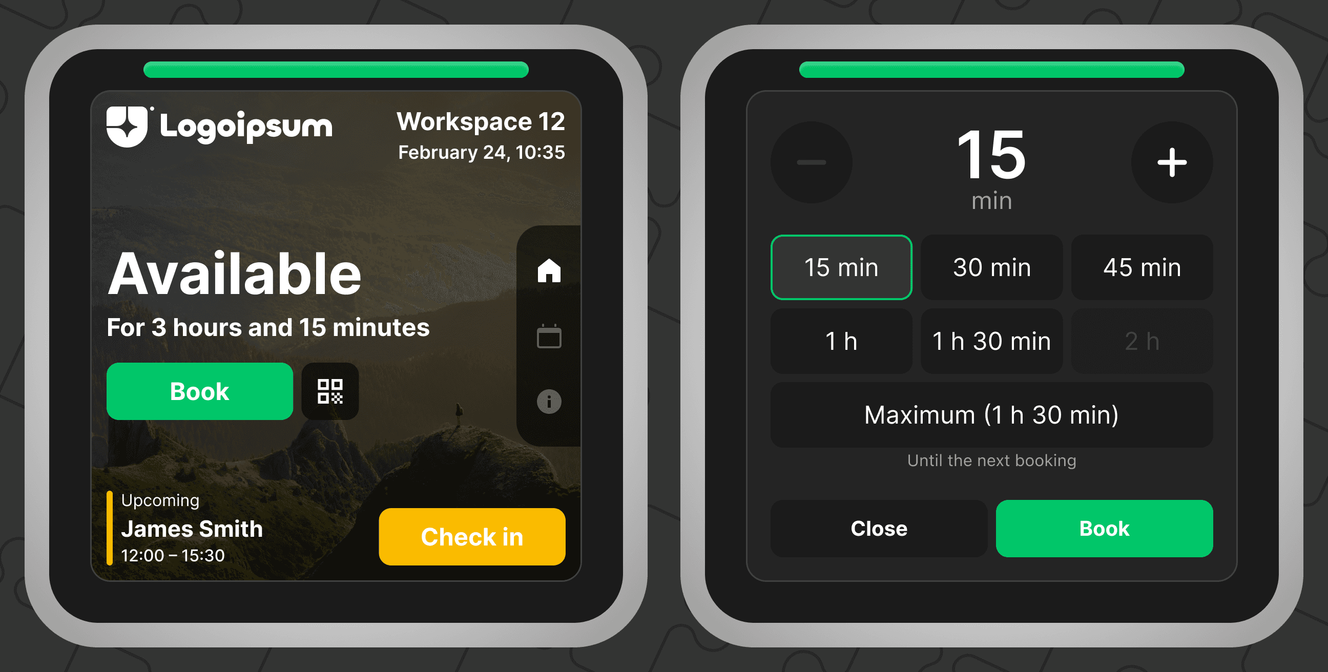
At Spaceti, I led design on multiple products, including the Meeting Room App and Booking Panel App - both designed from scratch. The Meeting Room App is installed on tablets mounted by the door that makes room availability obvious at a glance and lets people instantly book, check in, extend or end meetings early, find another room, and view room details. The Booking Panel App uses the same system logic but runs on compact devices placed in hot-desk zones and can also manage rooms.
Problem
My goal was to solve the following problems: lack of clarity and transparency, wasted office real estate, and unnecessary friction.
The root causes included:
Slow on-the-spot booking via phone or laptop
People staying past their time
Ghost meetings (no-shows)
Lack of clarity for visitors
Lack of transparency for employees
This challenge combined UX and business goals - improving speed, clarity, and reducing friction while increasing space utilization.
My Role & Scope
I owned the end-to-end UX and UI design, including the on-device admin area and activation flow, then supported implementation and iterations after release.
In scope:
Meeting room application for regular tablets
Meeting room application for conference room panels
On-device admin settings
Tablet activation
Desk booking panel application
Out of scope (handled via web apps, I designed separately)
Tablet management
Tablet activity logs
Full tablet setup workflow
Constraints
First, I gathered all constraints from clients, developers, and PMs.
It was going to be a multi-platform app. Some clients preferred cost-effective Android tablets over iPads, which meant accepting lower display quality. They required both vertical and horizontal orientation support. Screens could be as small as 7 inches, no E-Ink, and some tablets included built‑in status lights. Some rooms would have occupancy and environmental sensors inside.
Discovery
Next, I audited the market and defined requirements.
I reviewed existing solutions across:
Mobile and web booking tools
Competitor conference panels and “install-on-your-tablet” booking apps
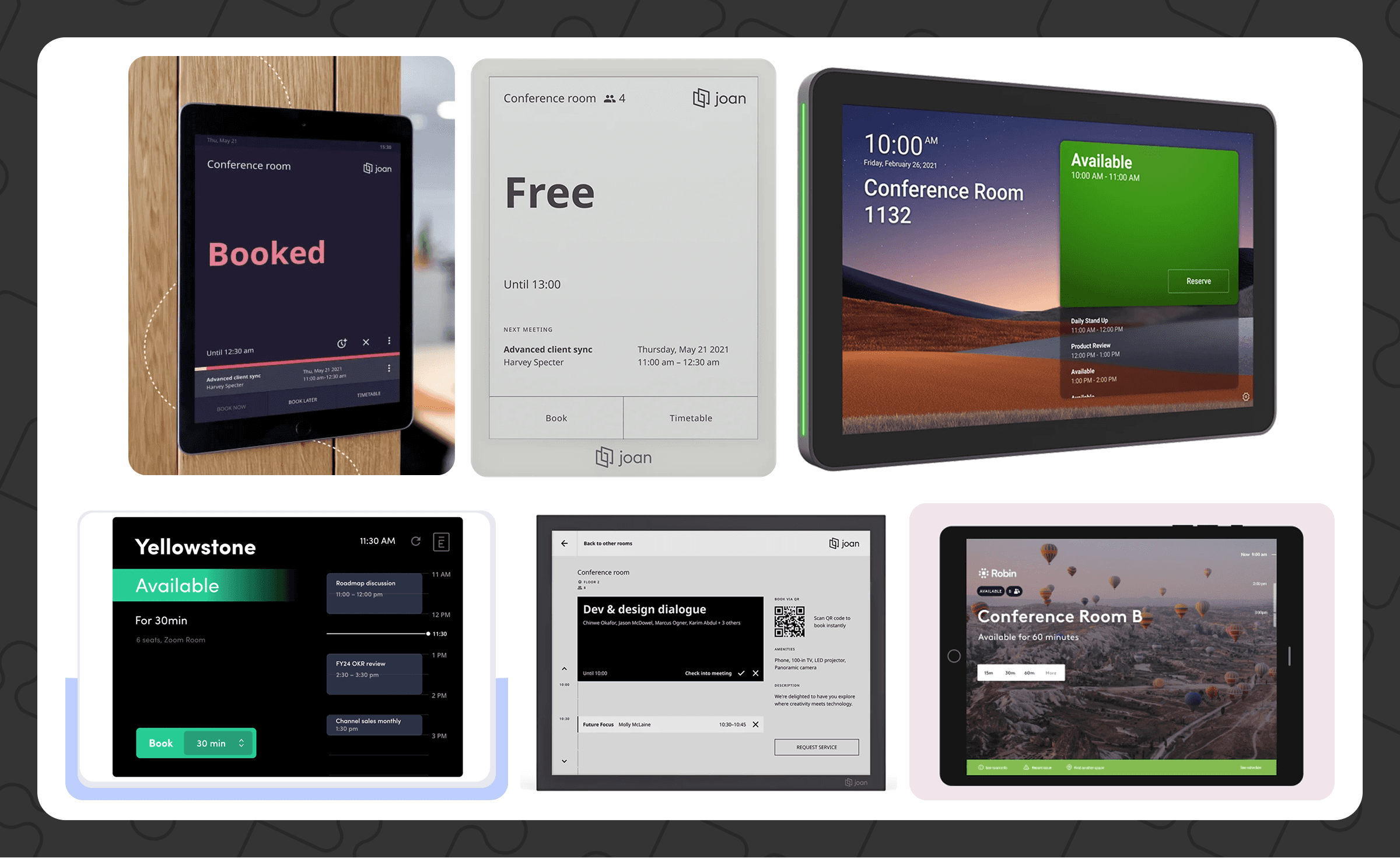
I collaborated with the PM to analyze competitors, customer insights, and user pain points to transform them into actionable requirements and defined features.
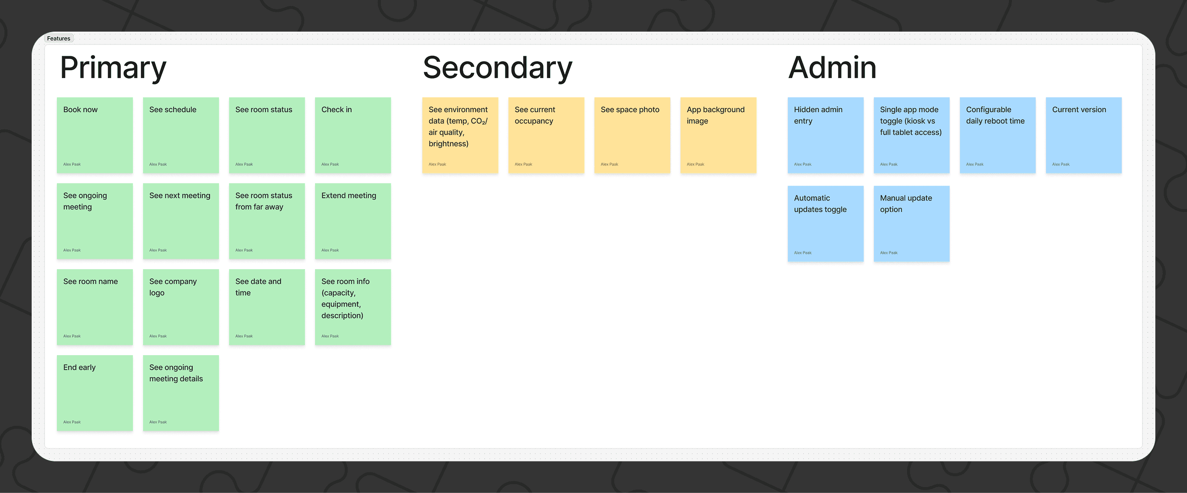
Data & User Flows
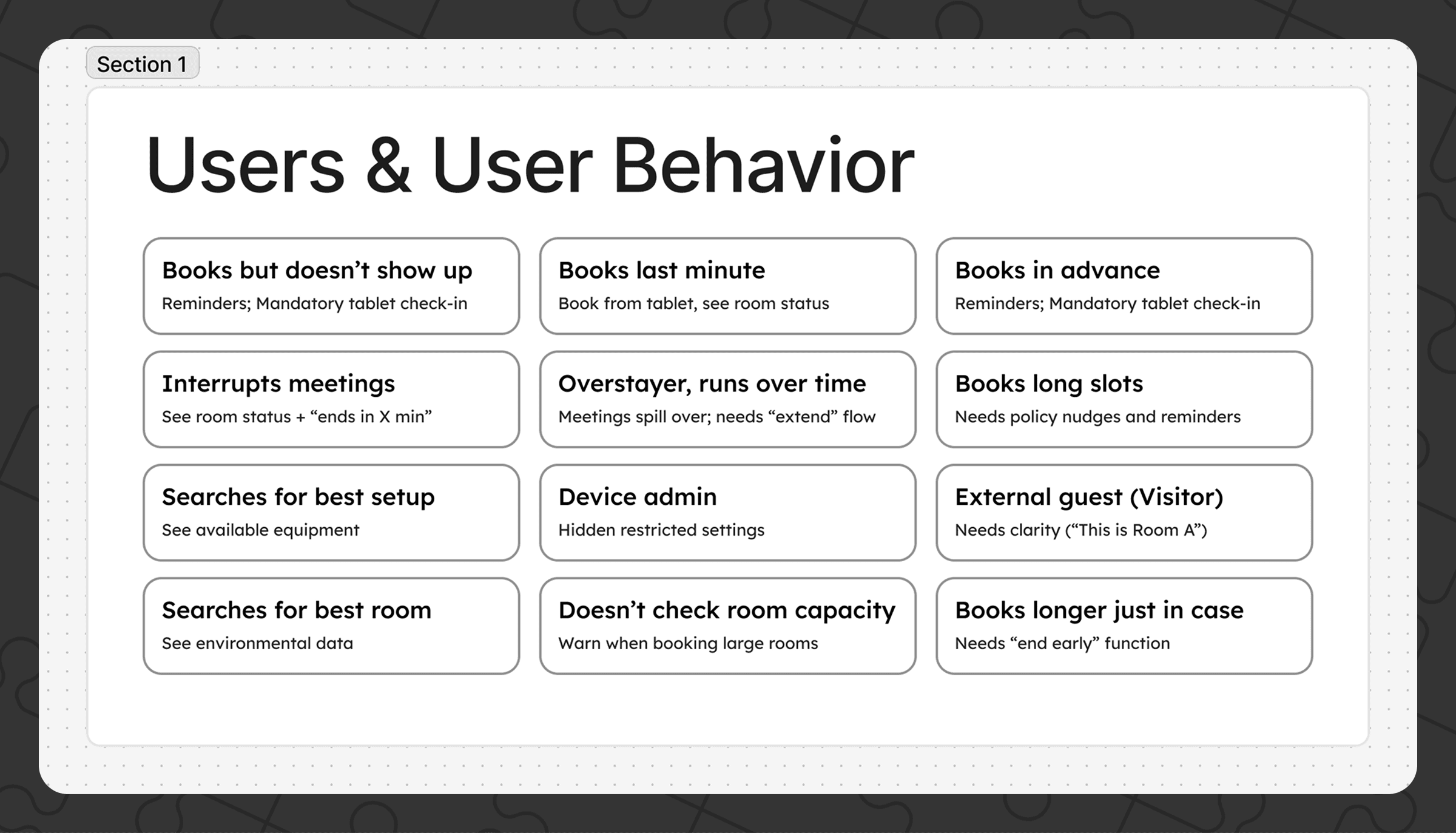
I defined key user behaviors to support both employees and visitors.
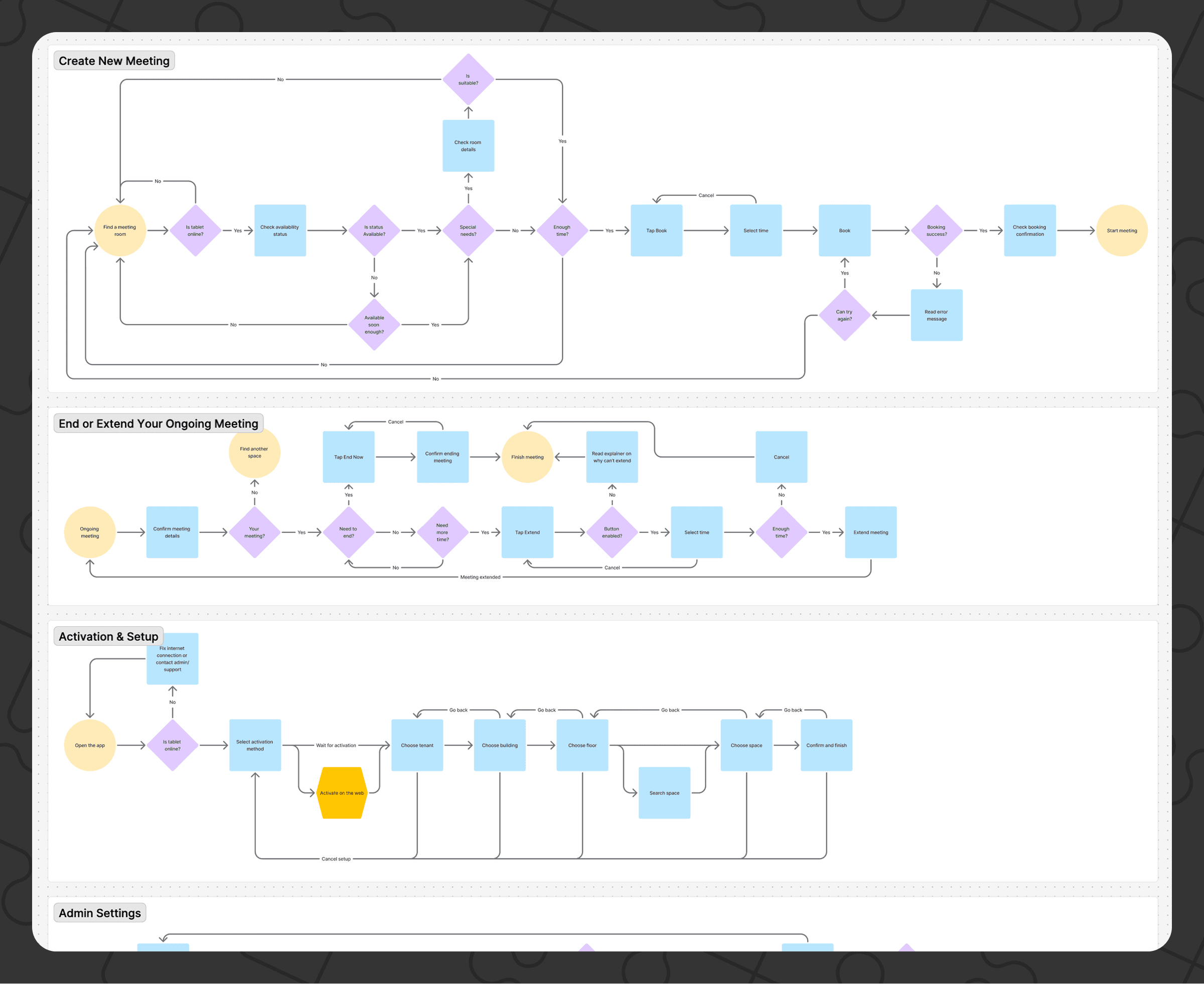
I mapped user flows for creating and managing meetings, device setup, activation, and admin tasks.
To inform design decisions, I collaborated with the the team to collect data such as:
Most common meeting durations (to determine default meeting time, preselected time picker values, increments)
Room Capacity vs. Actual Attendees (how common is it to have a large room booked for a couple of people - to trigger a warning when large rooms were underutilized)
Required screen resolutions
Ideation
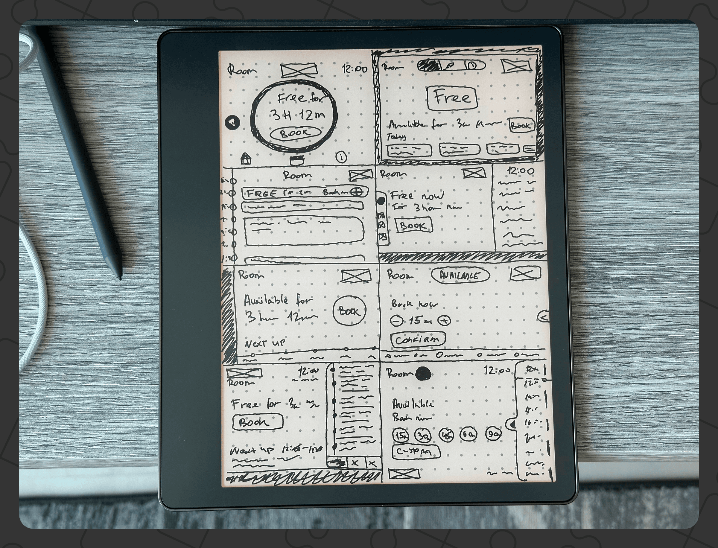
I did Crazy 8s together with some of the team members, we sketched different possible solutions to choose a direction, and then I expanded the strongest ideas into detailed sketches. Shared concepts internally, collected votes and critique, then designed the two best options in Figma, and selected the final direction based on clear tradeoffs and rationale.
UI Strategy
I first assessed what elements could be reused or resized from our design system versus what needed custom design.
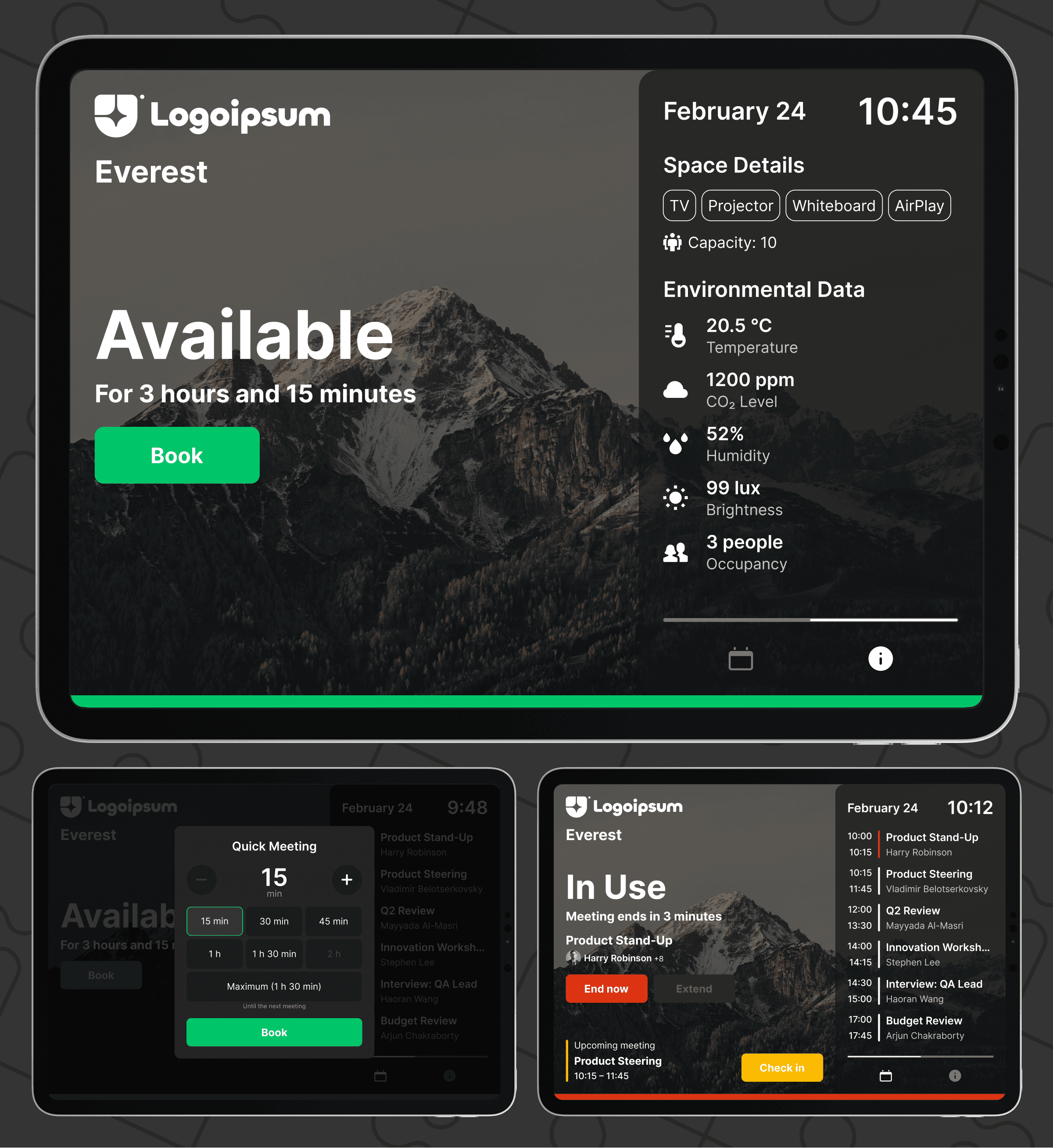
Core UI concept:
A persistent bottom status bar that is visible from far (hide if built-in status light)
Room status with most important info and primary actions in the center
Company and room name on top
A side panel with tabs for secondary info
Bottom check-in controls
I designed with more features in mind and left space for them throughout the UI for future iterations (QR codes, finding another space, room controls, ordering services, etc.).
I based my design on the following laws and principles: Choice Overload, Cognitive Load, Fitt's Law, Hick's Law, Jakob's Law, Law of Common Region, Law of Proximity, Miller's Law, Postel's Law.
Throughout the process, I used Figma Mirror to check designs on my iPad.
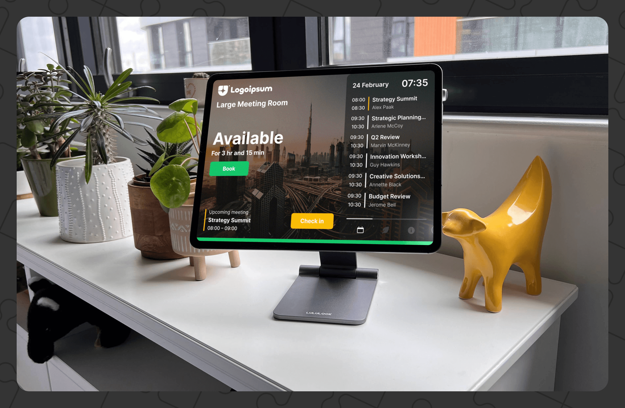
After completing the first demo screen and aligning with the team, I expanded the full prototype-ready UI.
Prototyping & Testing
I started with a distance test by mounting my iPad on a fridge with a magnet cover to test visibility.
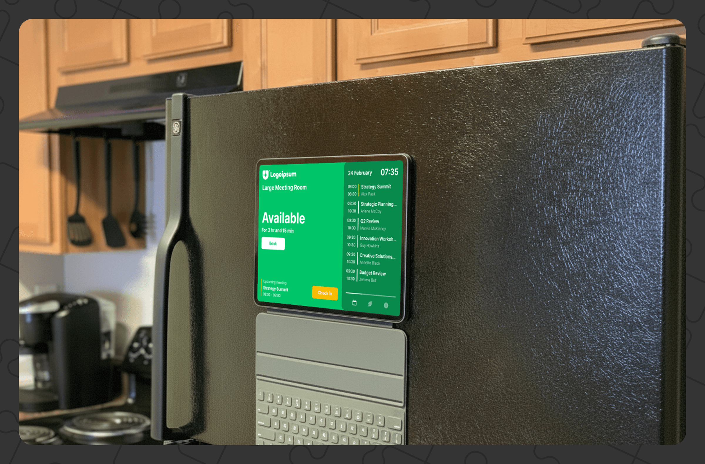
I built a clickable Figma prototype to test internally on my iPad and shared an online test with the clients.
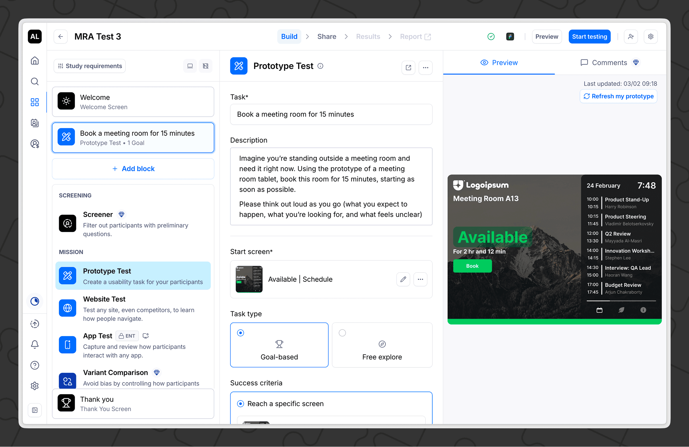
I tested scenarios such as:
Book a meeting for N minutes
Understand current status from far
Understand current status in detail
Understand who/what is occupying the room and for how long
Find and understand schedule
Find and understand room info
Understand constraints (why some durations aren’t allowed)
I measured Task Success Rate and Time on Task, and also did Five-Second Test (mostly testing room status understanding).
I held regular reviews with developers and PMs to validate feasibility and business fit, and iterated based on usability findings, technical constraints, and edge cases.
Polish & Delivery
I conducted accessibility tests with Stark for contrast ratios, color blindness simulations, and touch target sizes (even though the conditions were much better than normal - no outdoor glare or direct sunlight, relatively big screens).

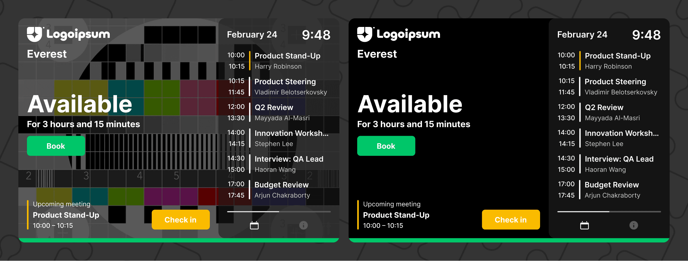
Next, I polished the existing screens and worked on the rest of the UI. I tested how well the UI worked with different backgrounds - a crucial step since each client controlled their background color or image.
For handoff, I prepared:
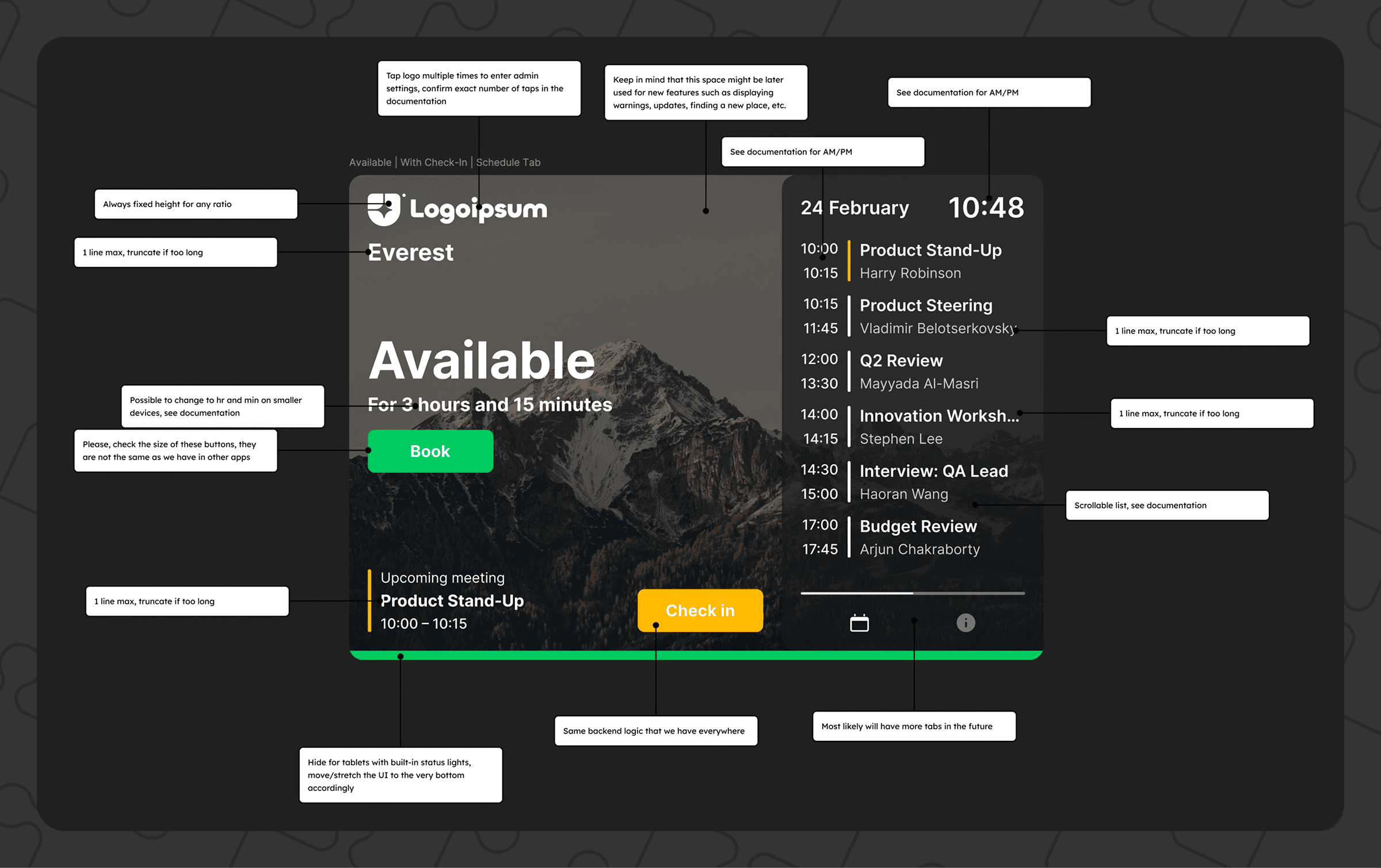
Full screen set in Figma
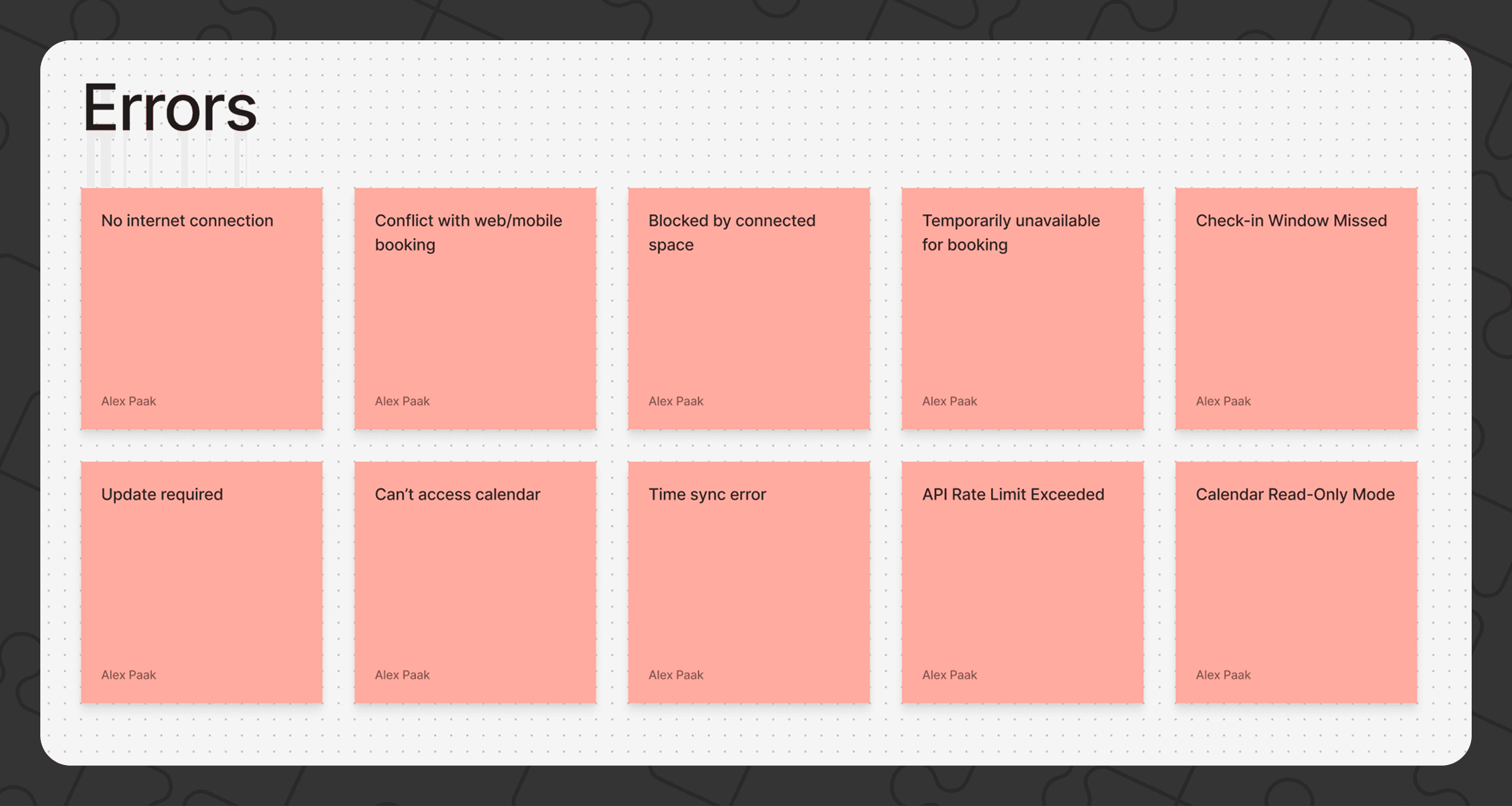
Dialogs, error states, and empty states
Documentation in Jira (time format rules, behaviors, etc)
Store assets (app icon, screenshots)
Layout variations (portrait/landscape, multiple sizes)
A clean Figma file with organized styles, variables, annotations, and connected flows
Implementation & Testing
I performed design QA to ensure implementation matched design intent.
Then I ran internal testing in our office corridor, observing natural behavior such as:
Do people still peek into rooms before checking the tablet?
How long does it take to create a new booking?
Do people squint, hesitate, or knock?
Are quick meetings common, and do default durations fit?
I brought a chair and took notes while sitting near the meeting rooms.

After collecting internal feedback and fixing minor issues, we then shipped to the stores and shared with clients.
Post-Launch
After release, I analyzed feedback from clients. Only two usability issues surfaced - UI elements too small and status bar visibility. I iterated accordingly and also added new features based on client requests:
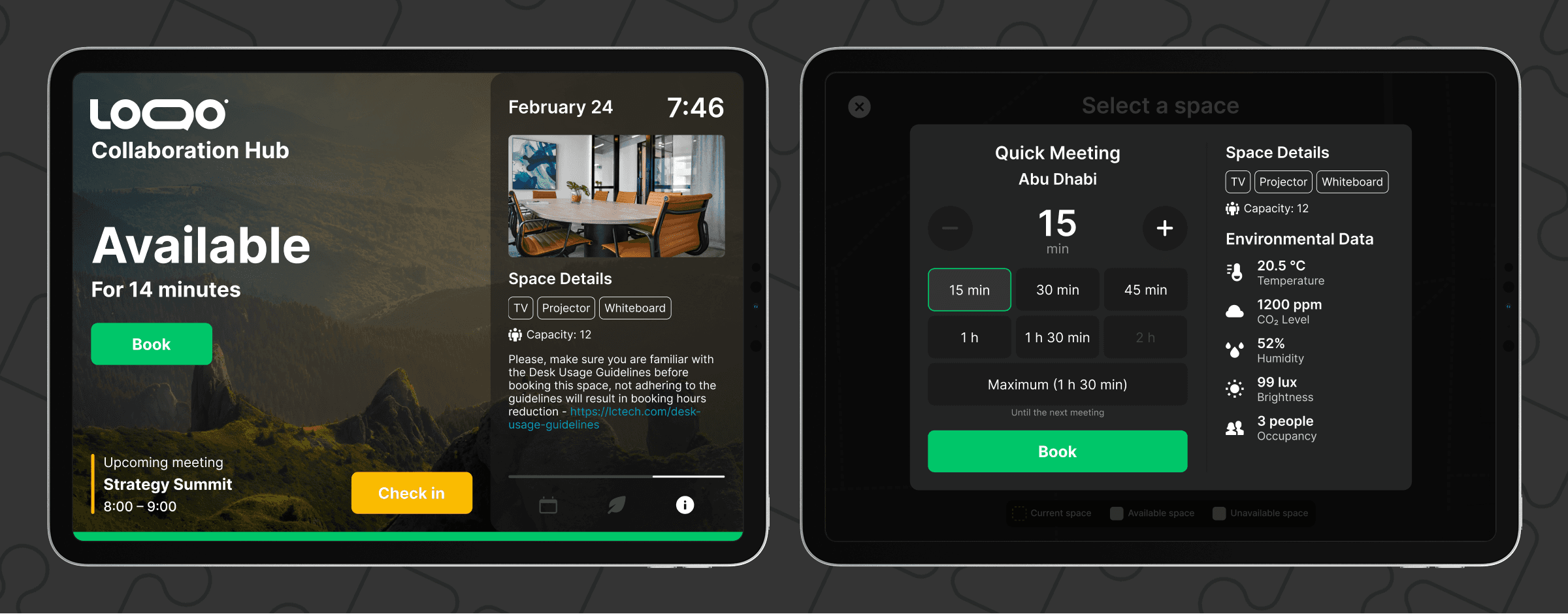
Space photo inside room info (for non-transparent rooms)
QR codes for links (rules, forms, terms of use)
Possibility to find and book another space
Update indicator
Current occupancy
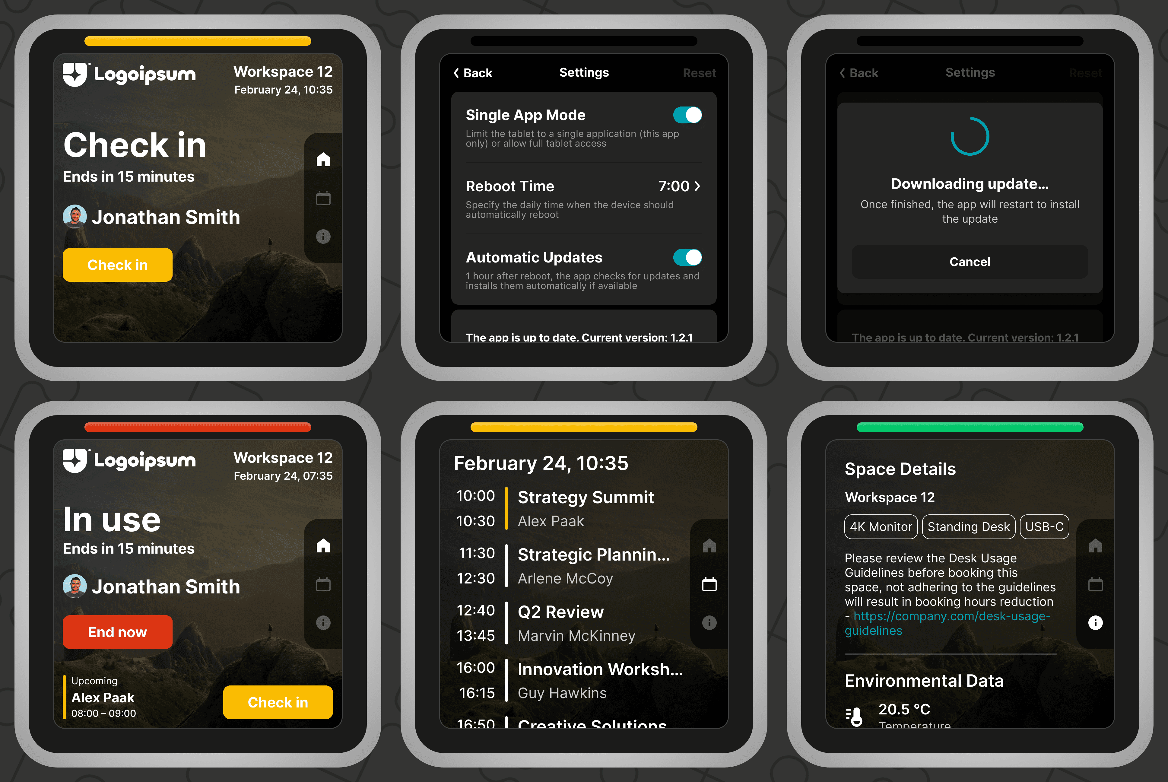
The biggest request was to support smaller displays and extend the app to desk booking panels. This required adjusting the UI but I managed to fit everything.
Success Criteria
For clients with occupancy sensors and historical booking data, impact was measurable. Almost no ghost meetings, reclaimed time from auto-released spaces freed up roughly 13% of total meeting-room hours. Overstay incidents decreased by roughly 22%, and the share of meetings where 1–2 people were using large rooms fell from about 30% to 16%, giving workplace teams a clear argument that they could delay adding new rooms.
For clients without occupancy sensors or historical booking data, success equaled client acceptance and zero critical UX complaints after launch.